Case Study: Visualising Young People's Participation Rates in Higher Education in the UK
This case study - conducted as part of the ESRC grant The use of interactive electronic-books in the teaching and application of modern quantitative methods in the social sciences - was undertaken with the kind involvement of Mark Gittoes.
Mark is the Head of Quantitative Analysis at the Higher Education Funding Council for England (HEFCE).
Together with Mark's colleague, Leyla Bagherli (an analyst at HEFCE), we discussed summarising and visualising young people’s participation rates in higher education (HE) in the UK, by geographical area. This has been an area of considerable research interest for Mark and his team at HEFCE, as reflected in a number of excellent visualisations and reports they have published online.
Taking one of these data visualisations as an example (at the time of our liaison with Mark and his team as part of the eBook project, this was rendered via Google Fusion, but since updated and rendered via Tableau): it plots the gap, at the ward-level, between the actual participation rate, and the participation rate expected given the characteristics of the young people in the ward, and other relevant aspects of the area, that have been statistically accounted for.
These gaps are represented on an ordinal scale consisting of five categories: from the greatest negative gap (i.e. observed participation rate is lower than expected participation rate) in quintile 1 to the greatest positive gap (i.e. observed participation rate is higher than expected participation rate) in quintile 5 (with the middle category - quintile 3 - assigned to wards where the observed participation rate is much as would be expected). They used an algorithm which ensured a roughly-equal proportion of the young cohort were in each quintile (i.e. roughly 20% in each).
The five categories of this scale are themselves derived from the ward-level residuals from a multilevel model; in this model, whether a young person participated in HE or not was the outcome variable (in a logistic regression model), with variables hypothesised to be relevant to the probability of a young person attending HE added as fixed effects (e.g. ethnic group, aspects of prior educational achievement, etc.). With ward added as a random effect, the ward-level residuals in this model thus represent the deviation in the youth participation rate in wards away from that expected given the characteristics accounted for by the fixed effects. t-statistics were derived from these residuals (and thus differences in sample sizes were taken into account), and these in turn were used to derive the quintiles on which the colour-coding of the map was based (a technical note, available online, provides further information).
Mark and his team were interested in extending this work in a variety of ways, one of which included allowing the user to select which fixed effects should be included in the model from which the quintiles were derived: i.e. effectively allowing them to choose which factors (at least as represented in the selection available to the analyst) should be accounted for before concluding that there is more, or less, participation by young people in HE in a given geographical area.
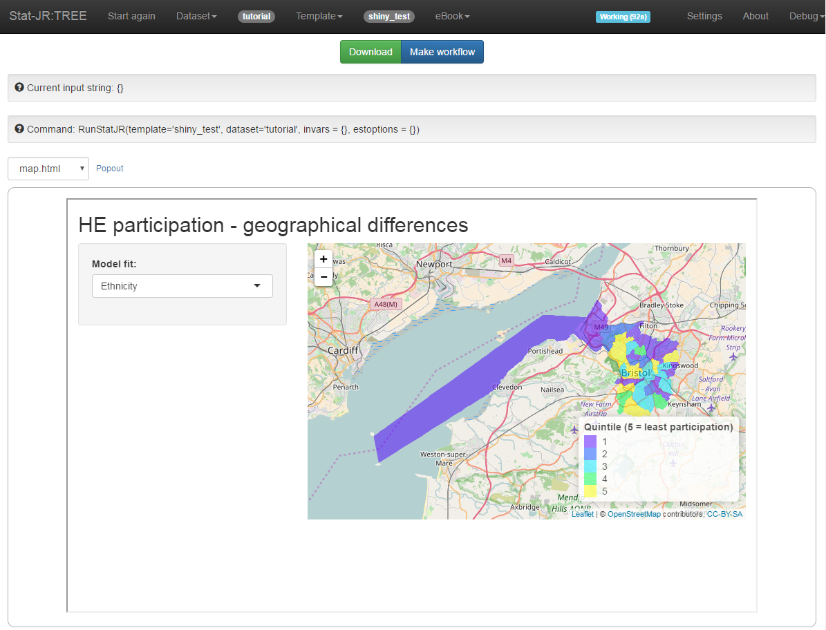
We investigated how this might be realised in Stat-JR. Stat-JR can interoperate with a wide variety of other third-party-authored statistical software; mindful of its ability to interoperate with R, for example, we explored the utility of embedding the output from a Shiny app within Stat-JR, taking advantage of R's ability, in turn, to interoperate with Leaflet in doing so. Here is a screenshot of a prototype (note that these data - namely the quintile categories - are randomly-generated for exemplar purposes!)

Of course, incorporating Stat-JR in this particular example is clearly optional (Shiny has a very good user interface just by itself), and we explored rendering the map via various Python libraries as well (Stat-JR is predominantly written in Python), but in either case there was a considerable computational overhead when rendering a large number of intricate polygons in a dynamic manner, and thus a lag between the user requesting a particular map view and its rendering on-screen. In the simple prototype above, the computational overhead is of course relatively trivial, as we are plotting only a few polygons by means of example, but it is naturally a more satisfactory user experience to survey the whole of England, and modify the map view around that territory as desired (Google Fusion can get around this by employing pre-rendered tiles (and a very large server)) Of course another option might be to plot simple geometric shapes (such as circles, hexagons, etc.) which would obviously be much quicker to render, but would inevitably lose some geographical information and flavour.
As you can see, HEFCE have since done excellent work putting this idea in place using Tableau, with the current (at the time of writing) version of the map allowing the user to make just this choice (the choice of Tableau, as opposed to Google Fusion, allows for a more tailored user interface).
Analysing, summarising and visualising important data pertaining to higher education continues to be a high priority for HEFCE, and an area of continued work, as their recent updates to, and plans for further development of, the data under consideration in this particular example exemplify.